¶ Introduction
There are two main options for making figures in DataSHIELD. First, you can use DataSHIELD functions which automatically generate figures. This is often the best option if you want to visualise information quickly and don't need too much control over the design. Second, you can save summary statistics obtained via DataSHIELD and use these statistics to create your own figures using standard R packages (e.g. GGPlot2).
¶ Load libraries
library(dsBaseClient)
library(ggplot2)
library(dplyr)
¶ Using DataSHIELD functions
¶ Histograms
Histograms provide a visual depiction of how one variable is distributed. They are privacy-preserving because no individual points are disclosed - instead values are "binned" into groups of a similar magnitude. Any bins with very low counts are removed, so if you have a symmetric distribution, you may find some things aren't observed at the extreme ends.
Let's create a histogram visualising serum cholestorol within the cnsim dataset.
ds.histogram(x='cnsim$LAB_TSC', num.breaks = 10)
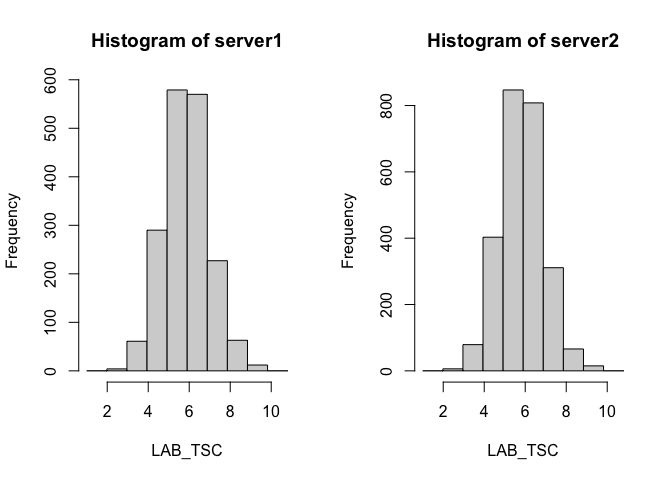
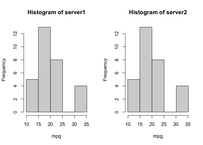
We also receive a warning that there were 2 invalid cells, due to small cell counts. If we want to reduce the data excluded we can reduce the number of bins, and the cost of lower resolution.
ds.histogram(x='mtcars$mpg', num.breaks = 5)
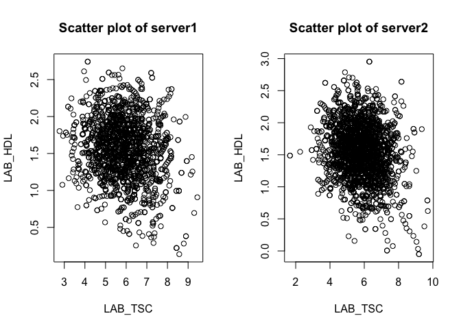
¶ Scatterplots of two numerical variables
DataSHIELD generates anonymised scatter plots using two methods:
- By adding a small amount of randomised noise to the scatter plot.
- By taking the average of the k nearest neighbours.
(for more details on how anonymisation methods are used for the generation of privacy-preserving visualisations you can read the paper https://bmcmedinformdecismak.biomedcentral.com/articles/10.1186/s12911-022-01754-4#Sec14).
Let's visualise how serum cholesterol correlates with HDL cholesterol. We see a negative correlation: as HDL cholesterol increasees, serum cholesterol decreases..
ds.scatterPlot(x = "cnsim$LAB_TSC", y = "cnsim$LAB_HDL")
## [1] "Split plot created"
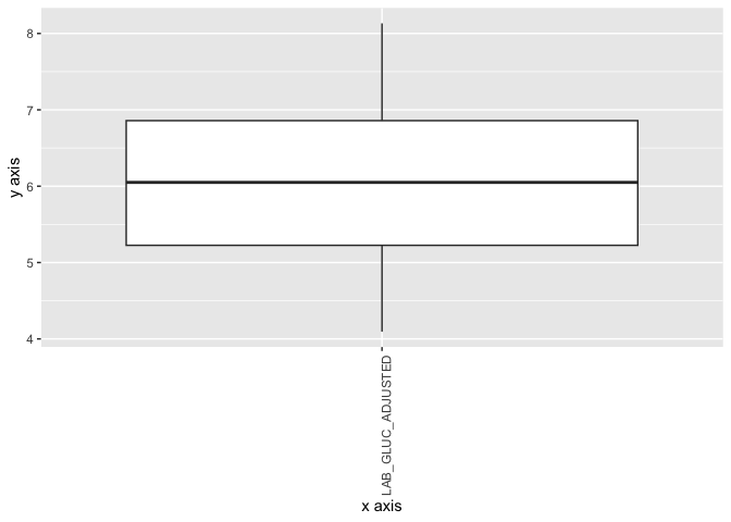
¶ Boxplot
A boxplot (or box-and-whisker plot) is a way to show the distribution of a dataset using five key summary numbers: (i) minimum, (ii) 1st quartile, (iii) median, (iv) 3rd quartile and (v) maximum. In DataSHIELD as to not reveal individual values, the minimum and maximum are replaced by the 5th and 95th percentiles. In this example we can visualise the distribution of non-fasting glucose:
ds.boxPlot("cnsim", "LAB_GLUC_ADJUSTED")
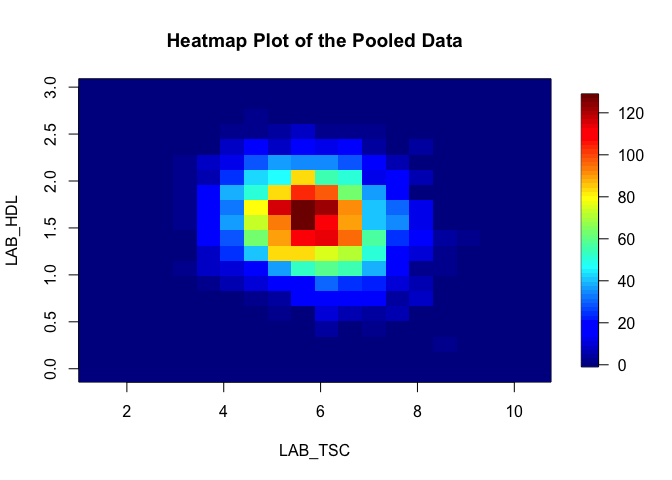
¶ Heatmaps
Heat maps are produced from density grids and can show clusters within data. Here we can visualise again how HDL and serun cholesterol covary:
ds.heatmapPlot("cnsim$LAB_TSC", "cnsim$LAB_HDL")
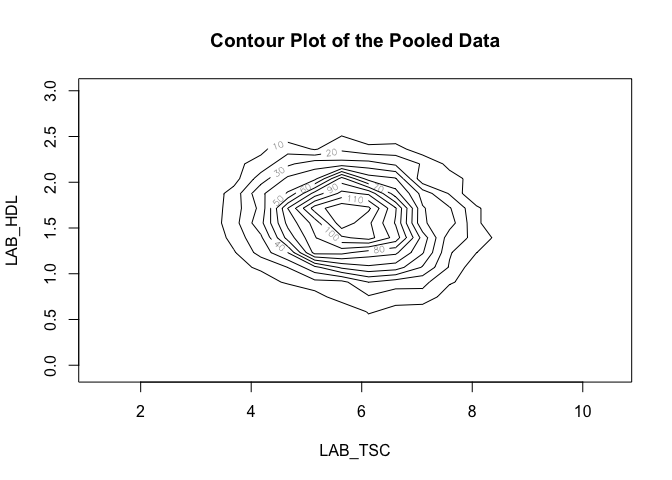
¶ Contour plot
A contour plot is a 2D plot that shows the shape of a 3D surface by drawing contour lines. Here we can again visualise the relationship between the same variables:
ds.contourPlot("cnsim$LAB_TSC", "cnsim$LAB_HDL")
¶ Making custom plots
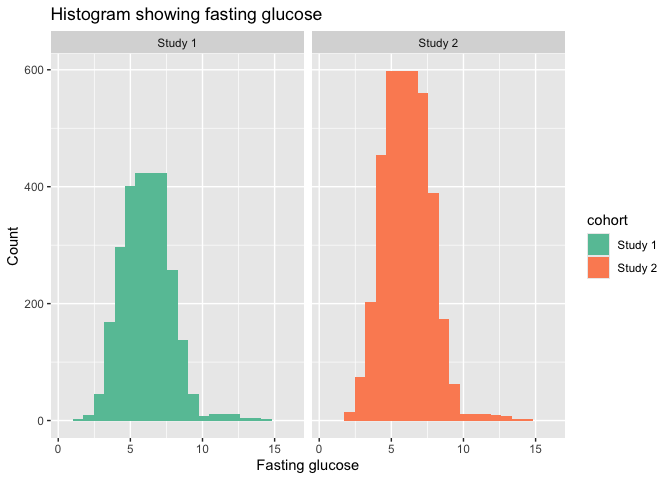
Whilst the above plots are customisable to some extent, they may fall short of publication-ready graphics. We can have a lot more flexibility if we first extract the summary data and use this to make the plots. Note, that not all datashield plotting functions return the underlying data so this will not be possible for all plot types. Here is an example using the summary data which is returned by ds.histogram:
quartiles <- ds.histogram("cnsim$LAB_GLUC_ADJUSTED", num.breaks = 20)
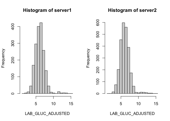
hist_data_1 <- data.frame(
  gluc = quartiles[[1]]$mids,
  count = quartiles[[1]]$counts,
  cohort = "Study 1")

hist_data_2 <- data.frame(
  gluc = quartiles[[2]]$mids,
  count = quartiles[[2]]$counts,
  cohort = "Study 2")

hist_data <- bind_rows(hist_data_1, hist_data_2)

ggplot(hist_data, aes(x = gluc, y = count, fill = cohort)) +
  geom_col(width = 2.2) +
  labs(title = "Histogram showing fasting glucose", x = "Fasting glucose", y = "Count") +
  facet_wrap(~cohort) +
  scale_fill_brewer(palette = "Set2")
¶ Exporting plots
¶ Using DataSHIELD functions
You can wrap the call to the DataSHIELD function as follows and the plot will be saved in your working directory:
png("my_histogram.png", width = 800, height = 600)
ds.histogram("cnsim$LAB_GLUC_ADJUSTED", num.breaks = 20)
dev.off()
For custom plots you can save the figure to an object and then export:
my_custom_plot <- ggplot(hist_data, aes(x = gluc, y = count, fill = cohort)) +
  geom_col(width = 2.2) +
  labs(title = "Histogram showing fasting glucose", x = "Fasting glucose", y = "Count") +
  facet_wrap(~cohort) +
  scale_fill_brewer(palette = "Set2")

ggsave("my_custom_plot.png", plot = my_custom_plot, width = 6, height = 4, dpi = 300)
¶ Logout
datashield.logout(conns)